
How do you keep brand colours consistent across wall graphics, glass and dimensional signs?
Use an agreed colour reference, then assess a physical sample of each proposed material under the lighting where it will be seen. The aim is a coordinated result across the space. A printed wall graphic, transparent glass film and painted or coloured dimensional sign may not look identical even when they begin with the same digital colour value.
Why the same colour can look different
Materials interact with light differently. An opaque print reflects light from its surface, while a transparent film is also affected by the view and light behind it. Gloss, texture and the colour of the underlying surface can change the appearance. Natural wood adds its own grain and variation.
The lighting matters too. A reception wall seen under warm artificial light can appear different from a window graphic seen in daylight. Copying a colour code into every artwork file does not remove those physical differences.
Agree what the reference actually is
Supply the current brand guidelines and original artwork, including any specified colour references. If a physical brand sample is the standard you work to, include it. Avoid treating a screenshot, an old sun-exposed sign or an unlabelled office print as the master reference.
Identify the colours that matter most. A dominant corporate colour may deserve closer comparison than a minor colour within a large illustration. If a colour is outside what a selected print or material can reproduce, discuss a workable alternative before production.
Conceptual colour-proofing workflow. No exact-match or measured colour tolerance is implied.
Compare the complete material system
- For a wall graphic, consider the print material, finish and intended wall background.
- For glass, check transparency or opacity, the viewing side and what sits behind it.
- For raised signs, assess the selected surface finish and visible edges.
- For mixed installations, view the samples together rather than approving each in isolation.
A small sample helps assess colour and finish, but it does not show the full effect of a large graphic. Use layout proofs for scale and composition, and material samples for the physical appearance. They serve different purposes.
Approve the relationship, not a screen image
Place samples in the actual room where possible. Review them in the normal daytime and evening conditions, then record which combination was approved. Sometimes the most coherent result uses a deliberately complementary finish rather than forcing different materials towards a match they cannot achieve.
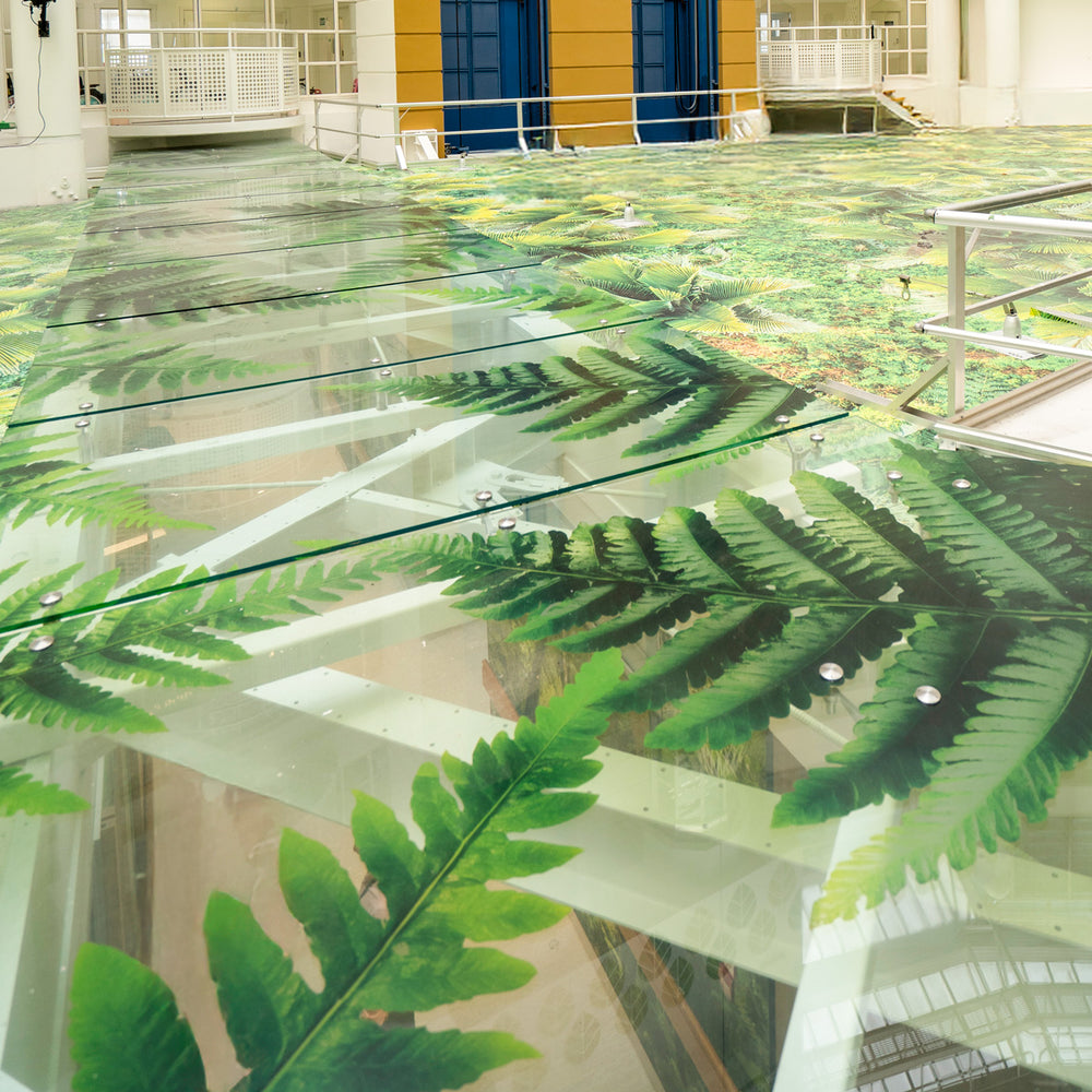
Our Starship Hospital Atrium project combines wall graphics, transparent printed elements and suspended features. It demonstrates why a whole environment needs to be considered together. It is not a claim that every material in a project can reproduce an identical colour.
Keep the reference for future work
Record the approved material, finish, artwork version and colour reference. Later replacements still need review: batches, material availability, lighting and ageing may change the comparison with existing work. Discuss the required level of consistency when the project is scoped.
For a new fit-out or refresh, send your brand guidelines and the list of surfaces involved. We can discuss the samples and approvals needed for your commercial murals, graphics and signage, with any achievable colour limitations made clear before production.
YOUR DECAL SHOP · NEW ZEALAND
Let’s talk about your space.
Have a question about your wall art or a commercial project? Send us a photo and the details, and we’ll help you work through the options.
Have a photo or drawing to share? Email it to us with your project details.